

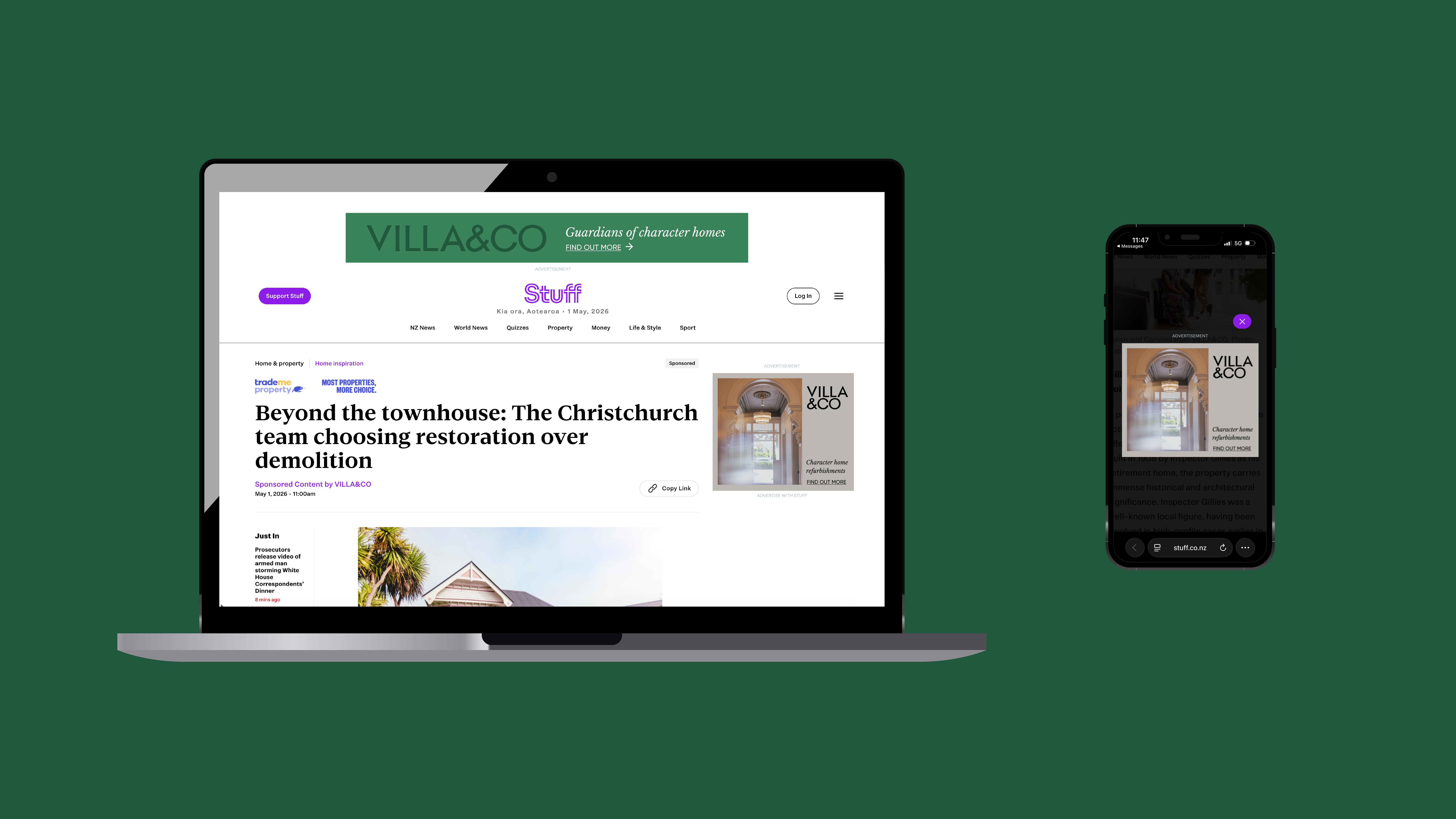
The challenge was creating a brand that clearly positioned Villa & Co as more than a property developer. The identity needed to communicate craftsmanship, guardianship and respect for the homes themselves, positioning Villa&Co as caretakers of character homes rather than simply renovators or builders.
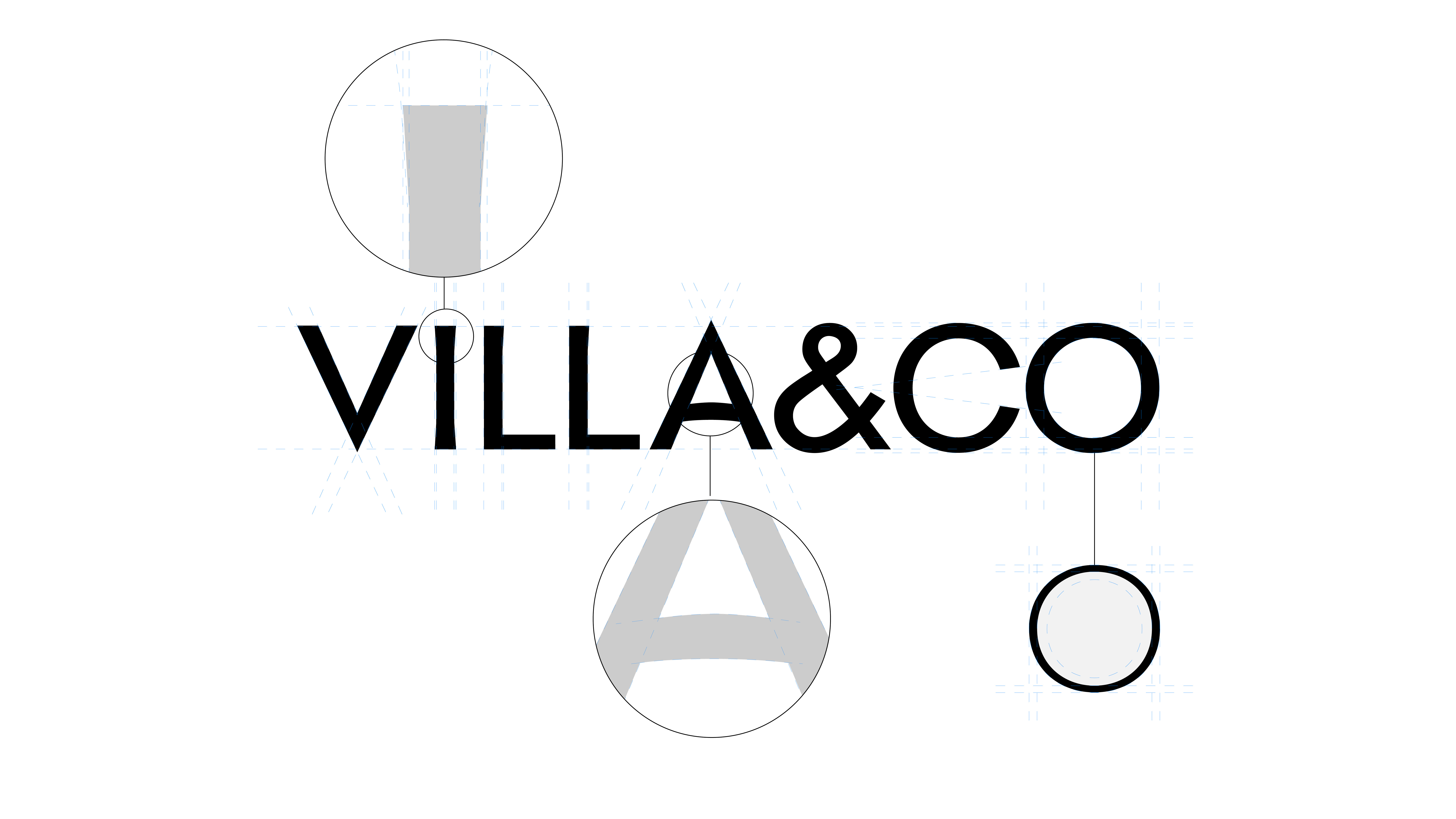
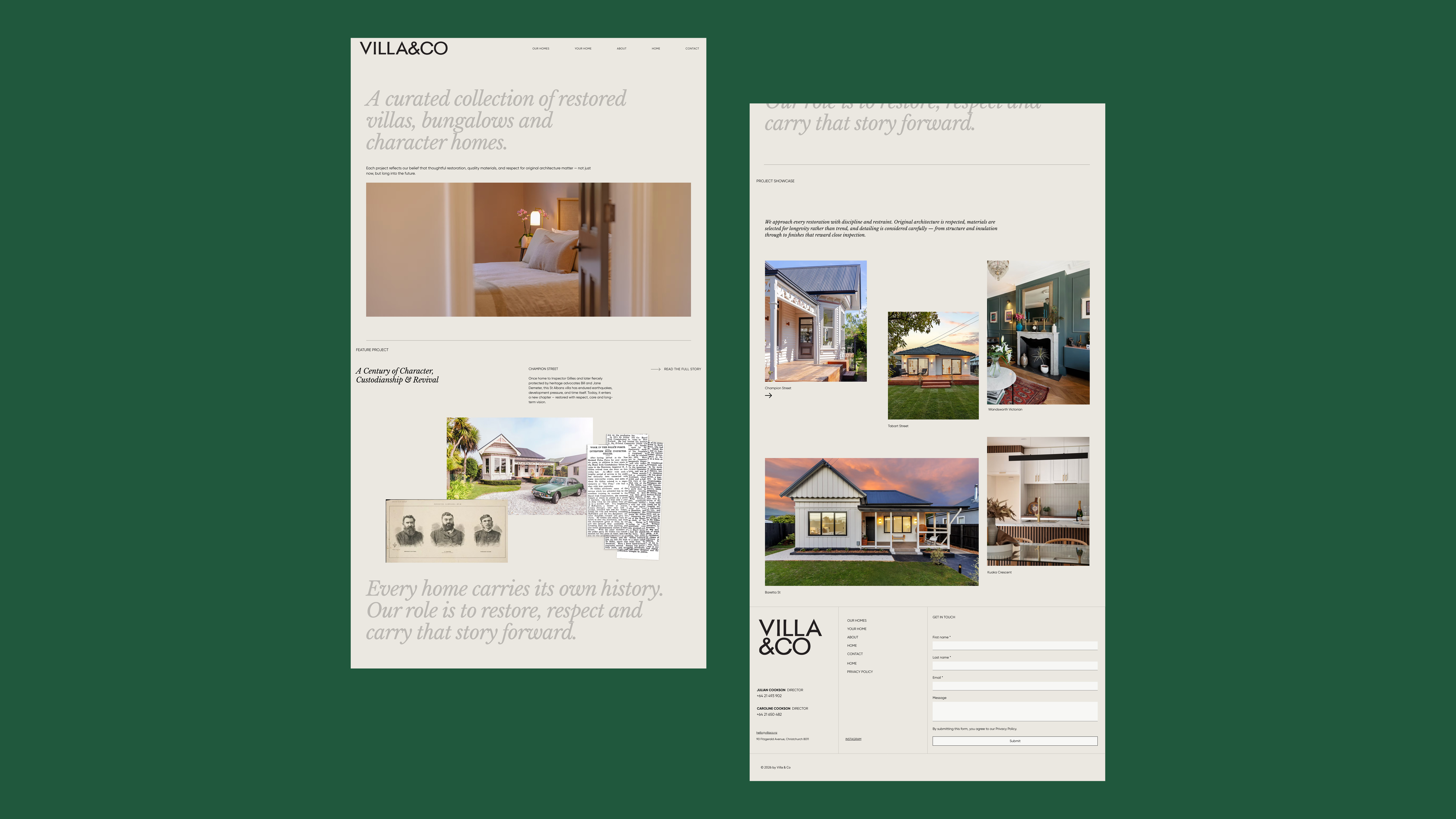
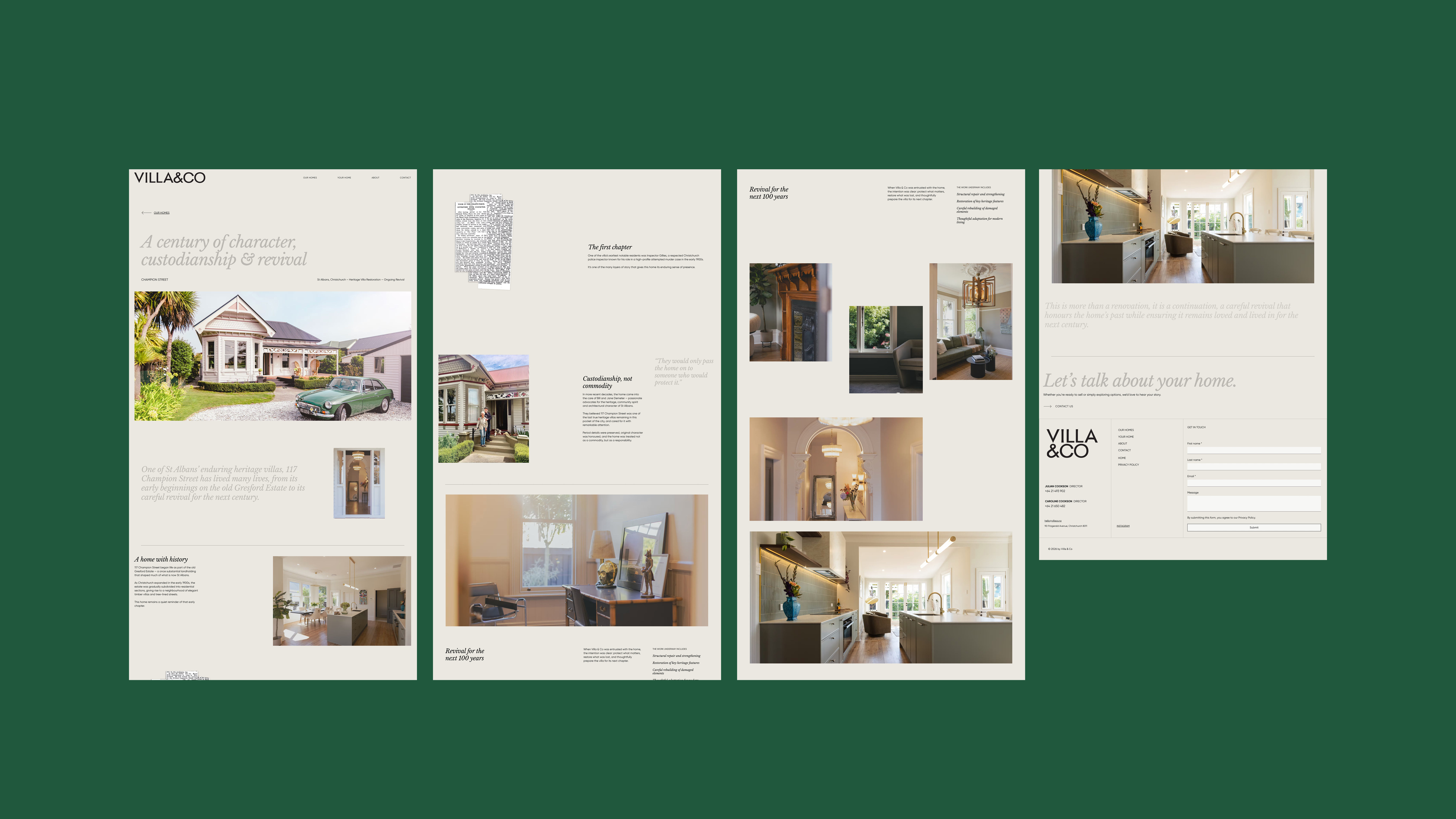
A considered visual system was developed drawing inspiration from historic typographic forms, architectural proportions and maker’s marks. Crafted typography and an individualised, scrapbook-inspired storytelling approach helped give Villa & Co a humanistic brand language where architecture, history and design felt considered and connected.
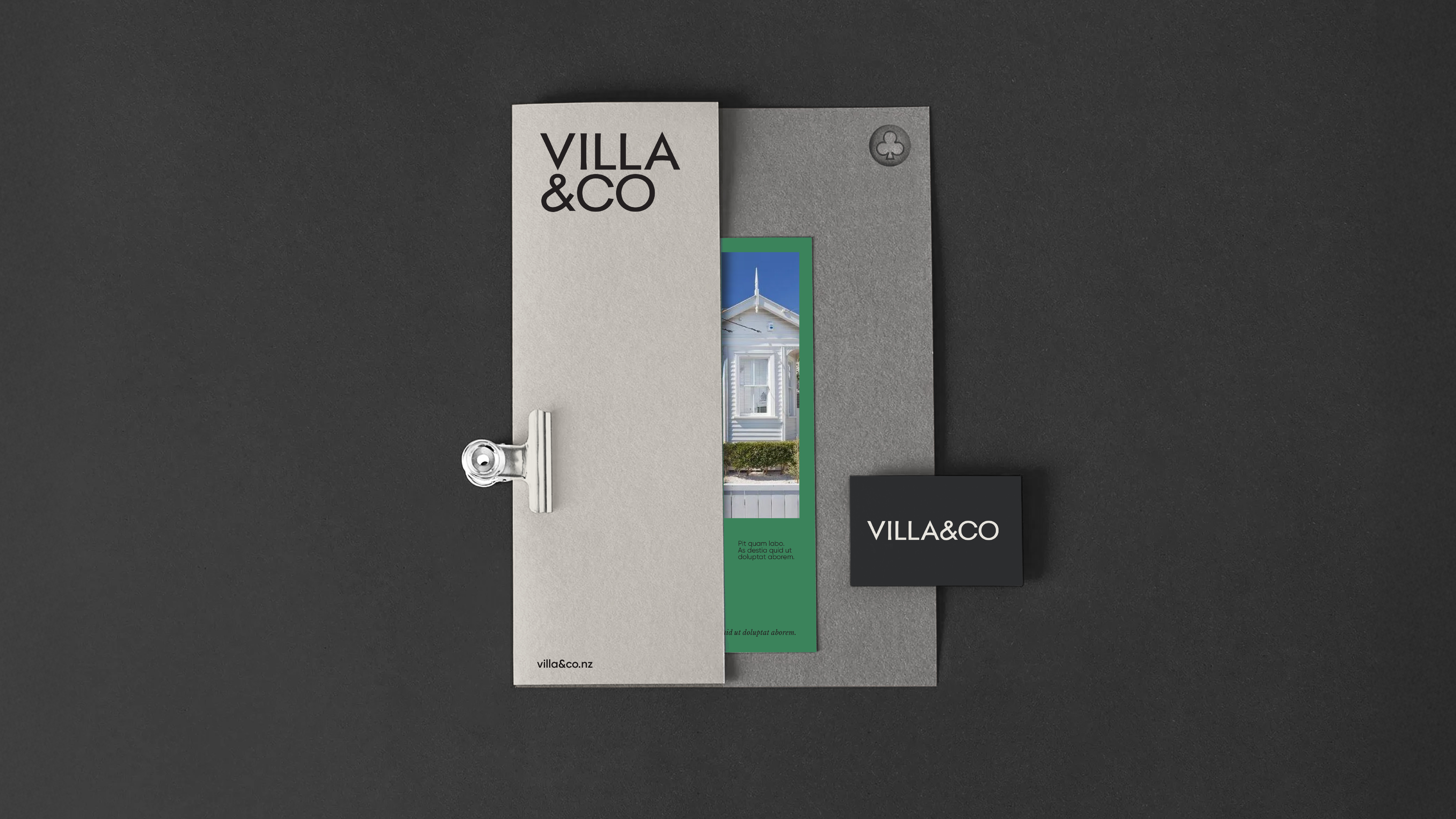
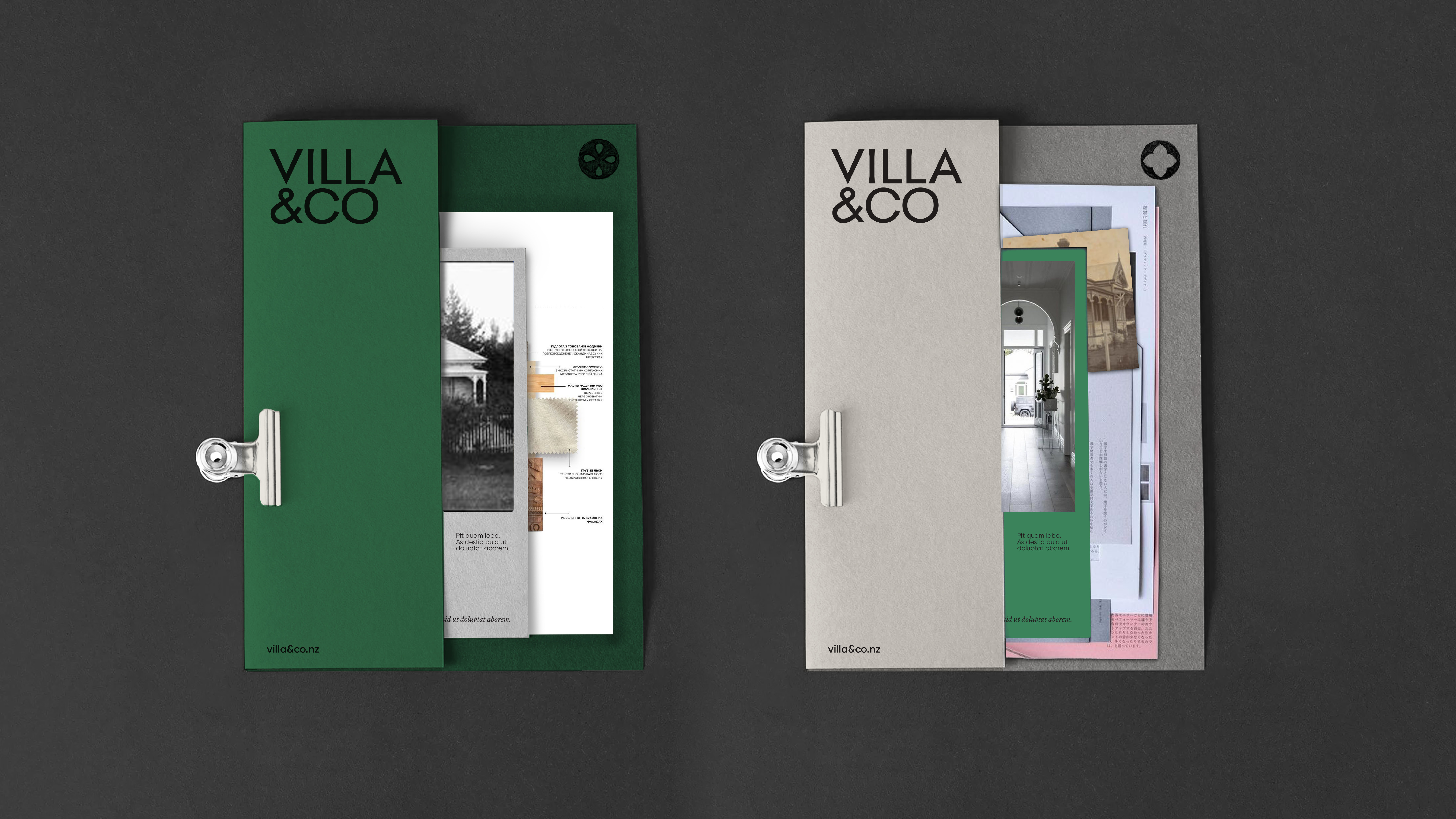

The logotype typography was influenced by Caslon’s Two Lines English Egyptian (1816), considered one of the earliest commercially sold sans-serif typefaces. Its architectural proportions, subtle irregularities and quiet confidence helped shape the brand mark.
